前言
实现水平垂直居中是一道经典的面试题,如果你能侃侃而谈这十种实现水平垂直居中的方式,一定会令面试官眼前一亮。按照实现方式的不同可粗略分为三类:绝对定位实现的四种、flex实现的两种、其他四种。
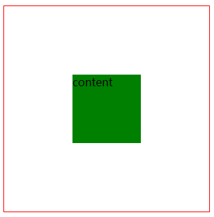
绝对定位实现的四种
<!DOCTYPE html>
<html lang="en">
<head>
<meta charset="UTF-8">
<meta name="viewport" content="width=device-width, initial-scale=1.0">
<title>水平垂直居中</title>
<style>
.father {
border: 1px solid red;
width: 300px;
height: 300px;
}
.box {
width: 100px;
height: 100px;
background: green;
}
.father {
position: relative;
}
.box {
position: absolute;;
top: 50%;
left: 50%;
margin-left: -50px;
margin-top: -50px;
}
</style>
</head>
<body>
<div class="father">
<div class="box">content</div>
</div>
</body>
</html>
|
flex实现的两种
<!DOCTYPE html>
<html lang="en">
<head>
<meta charset="UTF-8">
<meta name="viewport" content="width=device-width, initial-scale=1.0">
<title>水平垂直居中</title>
<style>
.father {
border: 1px solid red;
width: 300px;
height: 300px;
}
.box {
width: 100px;
height: 100px;
background: green;
}
.father {
display: flex;
justify-content: center;
align-items: center;
}
</style>
</head>
<body>
<div class="father">
<div class="box">content</div>
</div>
</body>
</html>
|
其他四种
<!DOCTYPE html>
<html lang="en">
<head>
<meta charset="UTF-8">
<meta name="viewport" content="width=device-width, initial-scale=1.0">
<title>水平垂直居中</title>
<style>
.father {
border: 1px solid red;
width: 300px;
height: 300px;
}
.box {
width: 100px;
height: 100px;
background: green;
}
</style>
</head>
<body>
<div class="father">
<div class="box">content</div>
</div>
</body>
</html>
|
<!DOCTYPE html>
<html lang="en">
<head>
<meta charset="UTF-8">
<meta name="viewport" content="width=device-width, initial-scale=1.0">
<title>水平垂直居中</title>
<style>
.father {
border: 1px solid red;
width: 300px;
height: 300px;
}
.box {
width: 100px;
height: 100px;
background: green;
}
</style>
</head>
<body>
<table class="father">
<tr align="center">
<td><div class="box">content</div></td>
</tr>
</table>
</body>
</html>
|
总结
绝对定位的四种,前三种要知道子元素的宽高
- absolute+负margin 常用、兼容性好。
top: 50%;left: 50%;margin-left: -50px;margin-top: -50px;
- absolute + margin auto;兼容性好。
top: 0;left: 0;right: 0;bottom: 0;margin: auto;
- absolute + calc;兼容性依赖calc的兼容性;
top: calc(50% - 50px);left: calc(50% - 50px);
- absolute + transform; 兼容性依赖translate2d;
top: 50%;left: 50%;transform: translate(-50%, -50%);
flex两种:目前在移动端已经完全兼容flex,PC端需要看业务的兼容性情况
- 父元素设置
display: flex;justify-content: center;align-items: center;即可
- 父元素设置
display: flex;子元素margin: auto;
其他四种写法:
- 行内块;将父元素设置
text-align: center;line-height: 300px(撑满);子标签display: inline-block;vertical-align: middle;line-height: initial; (控制好行高)利用了行内块和行内标签具有文本属性的特点
- grid ;但兼容性不如flex,子标签
align-self: center;justify-self: center;
- css-table :css新增的table属性,可以让我们把普通元素,变为table元素的现实效果,通过这个特性也可以实现水平垂直居中
display: table-cell; text-align: center;vertical-align: middle;
- table标签;table天然支持垂直居中,设置水平居中即可;缺点是 复杂;table本身就不适合做居中布局的
感谢小伙伴们的耐心观看,本文为笔者个人学习记录,如有谬误,还请告知,万分感谢!如果本文对你有所帮助,还请点个关注点个赞~,您的支持是笔者不断更新的动力!

 微信
微信 支付宝
支付宝